Virtual Credit Card
Reimagining credit in a QR-first economy
Platform
Mobile App
Deliverables
UI & UX
"Credit adoption is limited not by demand, but by usability."
The Gap
Credit in Nepal still feels like something from an earlier era.
Getting access usually means going through a lengthy process, waiting for approval, and relying on a physical card that can only be used in limited places. At the same time, QR payments have become part of daily behavior. People can scan and pay almost anywhere in seconds, but they cannot use credit with the same simplicity.
That disconnect is the real problem.
The issue is not only access. It is relevance. Credit has not adapted to the way people already transact.
The Shift
Digital payments in Nepal evolved around QR.
That means the opportunity is not to redesign a plastic card. It is to redesign credit so it fits naturally into the payment behavior people already understand.
Instead of asking users to adapt to traditional credit systems, this concept brings credit into the same flow as scan-and-pay.

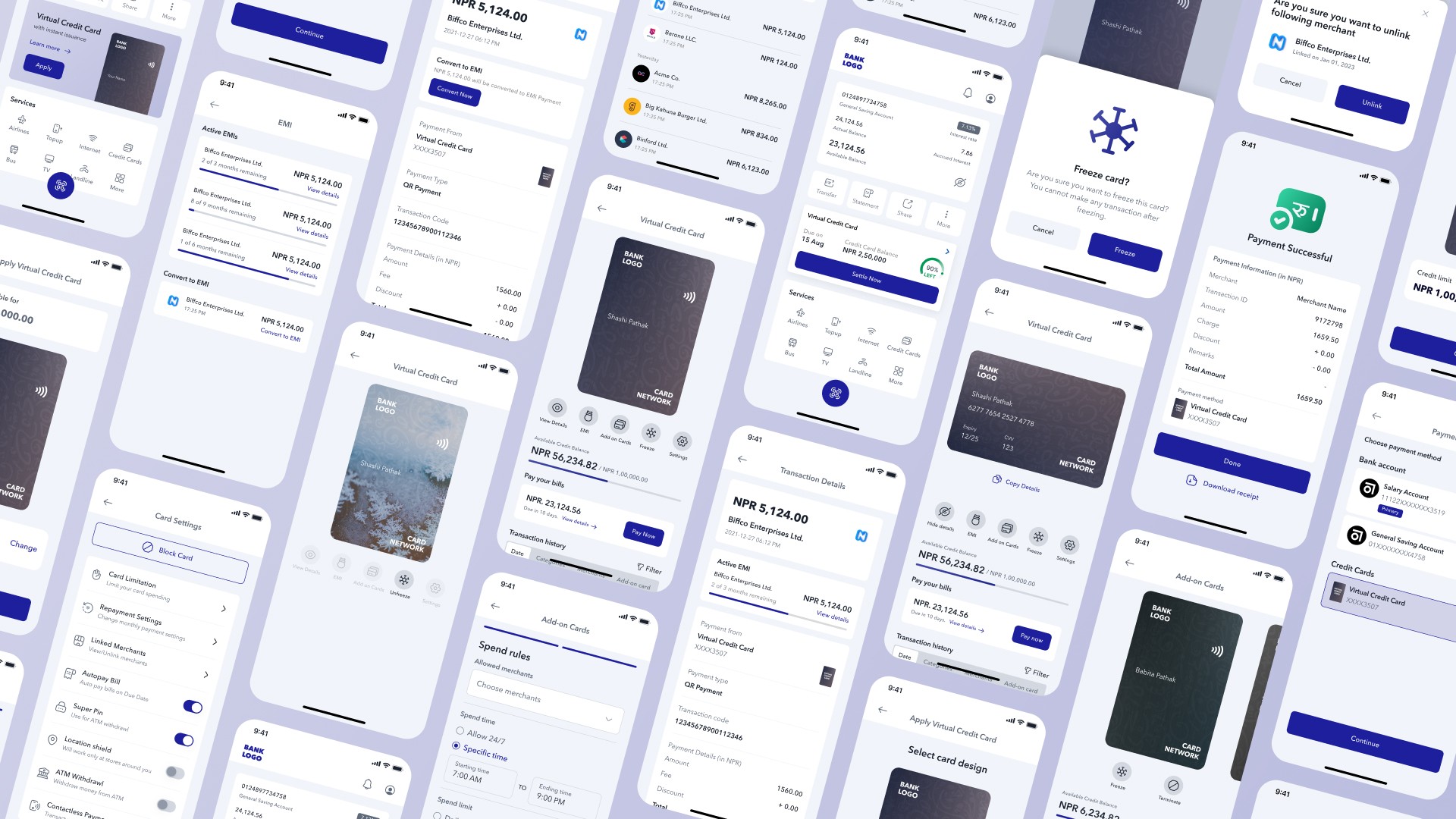
Visible From the Start
The experience begins inside the banking app, where users already manage their money.
Instead of treating credit as a separate product hidden behind a long application flow, the system introduces it directly from the dashboard. Eligibility is shown upfront, along with a clear credit limit and a direct entry point into the experience.
The intention here is simple: make credit feel immediate, understandable, and accessible from the first interaction.
Onboarding Without Friction
Traditional credit onboarding is often slow, unclear, and paperwork-heavy. This concept reduces that process into a few guided steps inside the app.
Users can define how they want to repay, choose the account linked to repayment, and personalize the card design before activation. The flow keeps the experience simple while still giving users meaningful control over how the product behaves.
The result is an onboarding process that feels guided, lightweight, and fully digital.

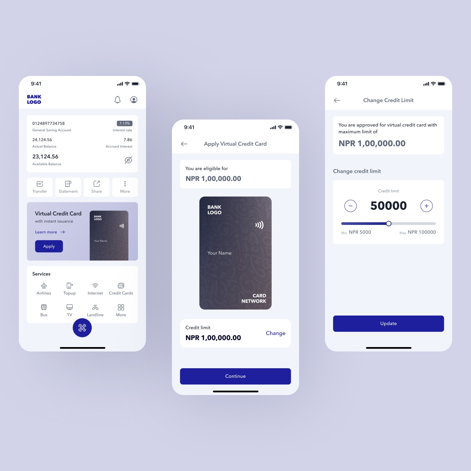
One Clear View
Once activated, the experience centers around one clear view.
Users can immediately understand how much credit is available, how much has been used, what needs to be paid, and which transactions are driving that balance. Instead of splitting this information across disconnected screens, the system brings the essentials together in one place.
This was important because one of the biggest problems with credit is uncertainty. When users do not understand how their credit works, trust drops quickly. The interface is designed to reduce that uncertainty and make credit feel transparent.
How It Works
At a system level, the product is designed to fit into an existing payment ecosystem rather than replace it.
Users apply directly inside the app, receive an approved limit, use that credit while making QR payments, and then manage repayment through either direct billing or EMI conversion. Each part of the flow is connected, visible, and easy to follow.
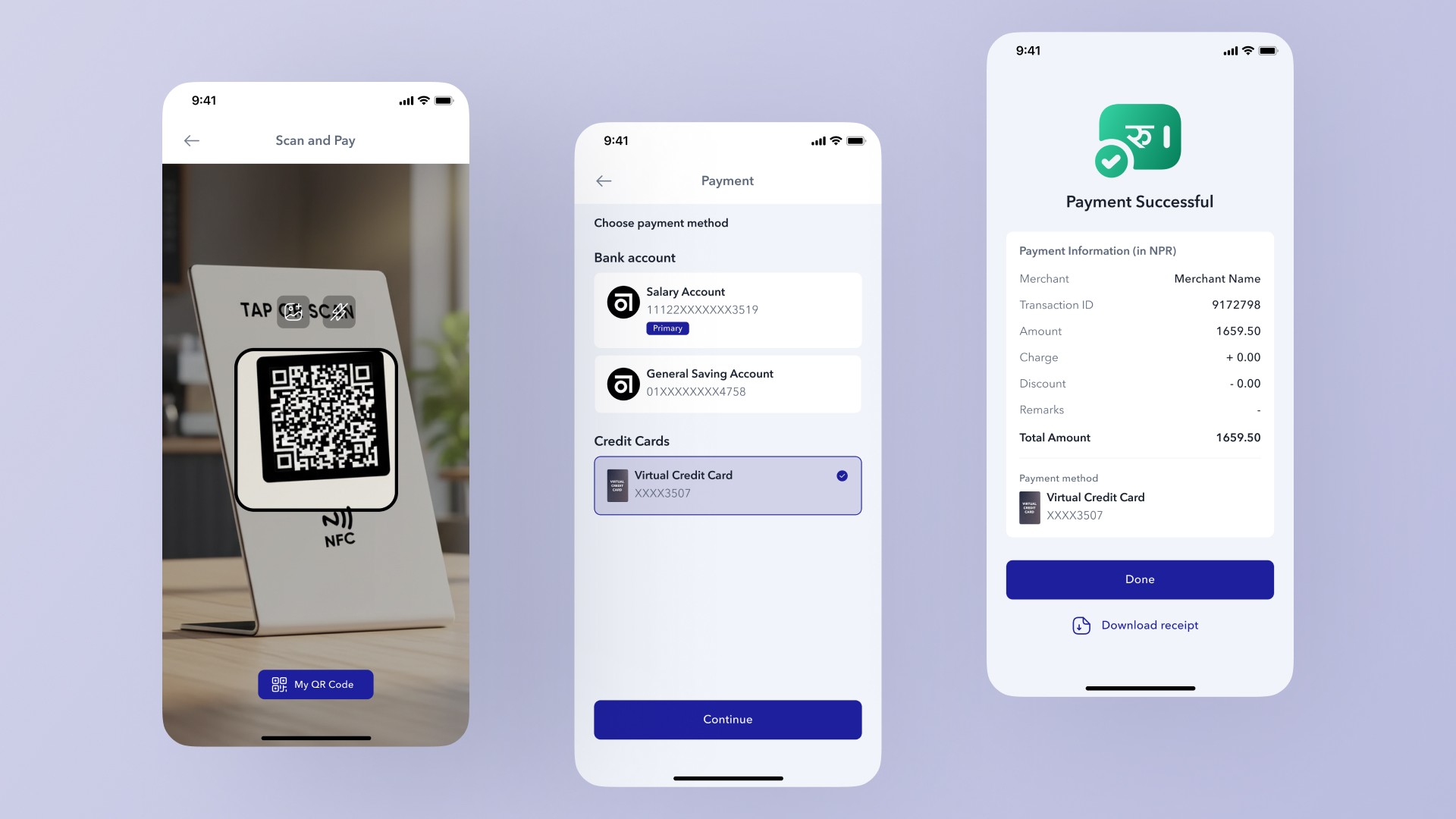
Paying with Credit, Naturally
The biggest shift happens at the point of payment.
Instead of creating a new or unfamiliar behavior, the concept builds on something users already do every day: scanning a QR code. After scanning, users can choose to pay using credit just as easily as they would pay from a bank account.
That small shift changes the role of credit completely. It becomes part of an existing habit rather than a separate system users have to learn.
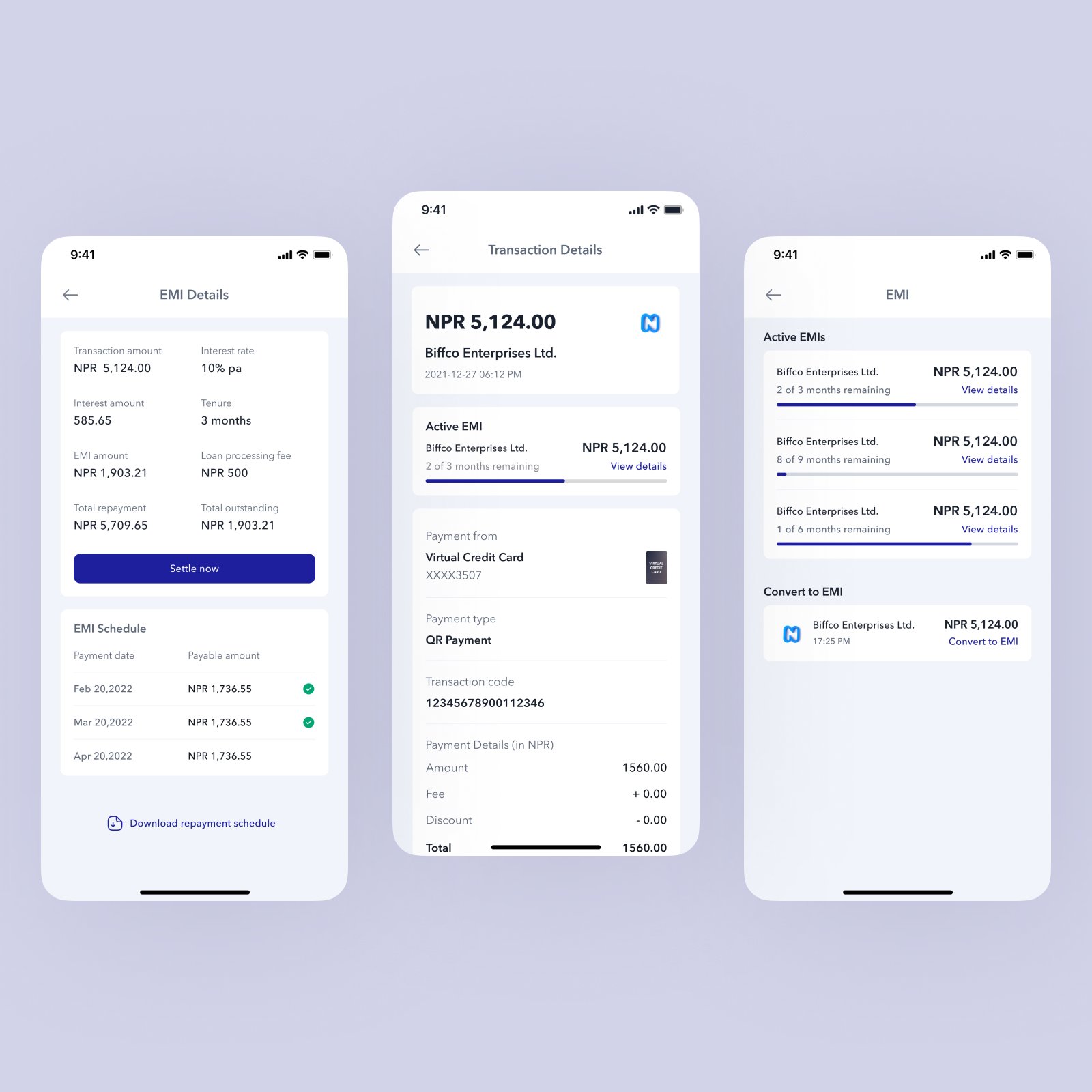
Transparent by Default
Every transaction is clearly recorded and easy to inspect.
Users can see where the payment was made, how it was processed, the exact amount charged, and the card used for the transaction. This level of visibility helps remove the ambiguity that often makes credit feel risky or difficult to manage.
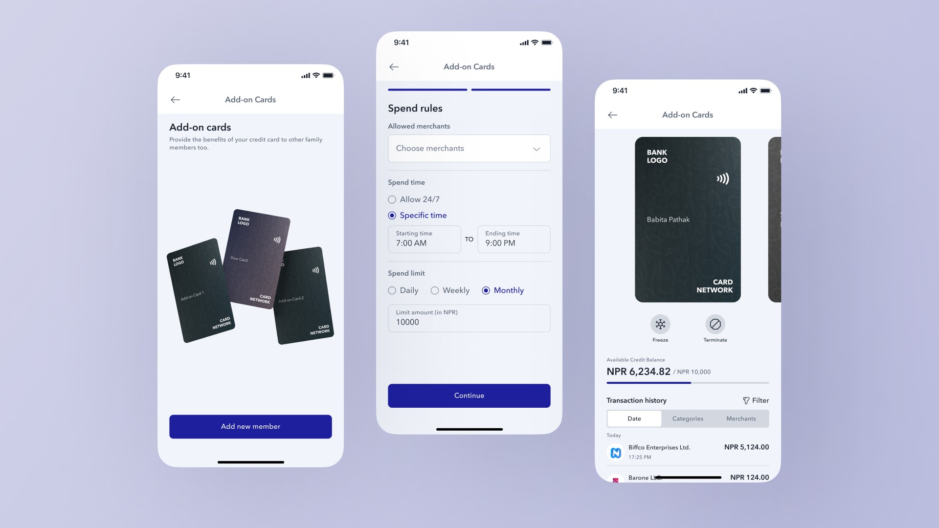
Extending Credit Across Family Use
Credit is not always used individually. In many cases, it naturally extends across family members.
The add-on card system supports this behavior by allowing users to issue additional cards with controlled rules around spending time, merchant access, and usage limits. This creates a more flexible credit model that reflects real-world household behavior instead of forcing a rigid one-user structure.
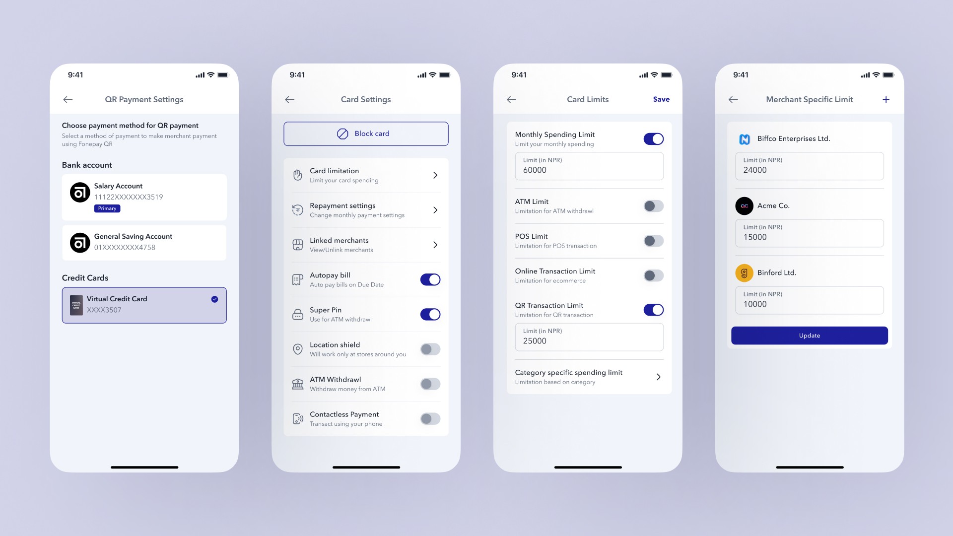
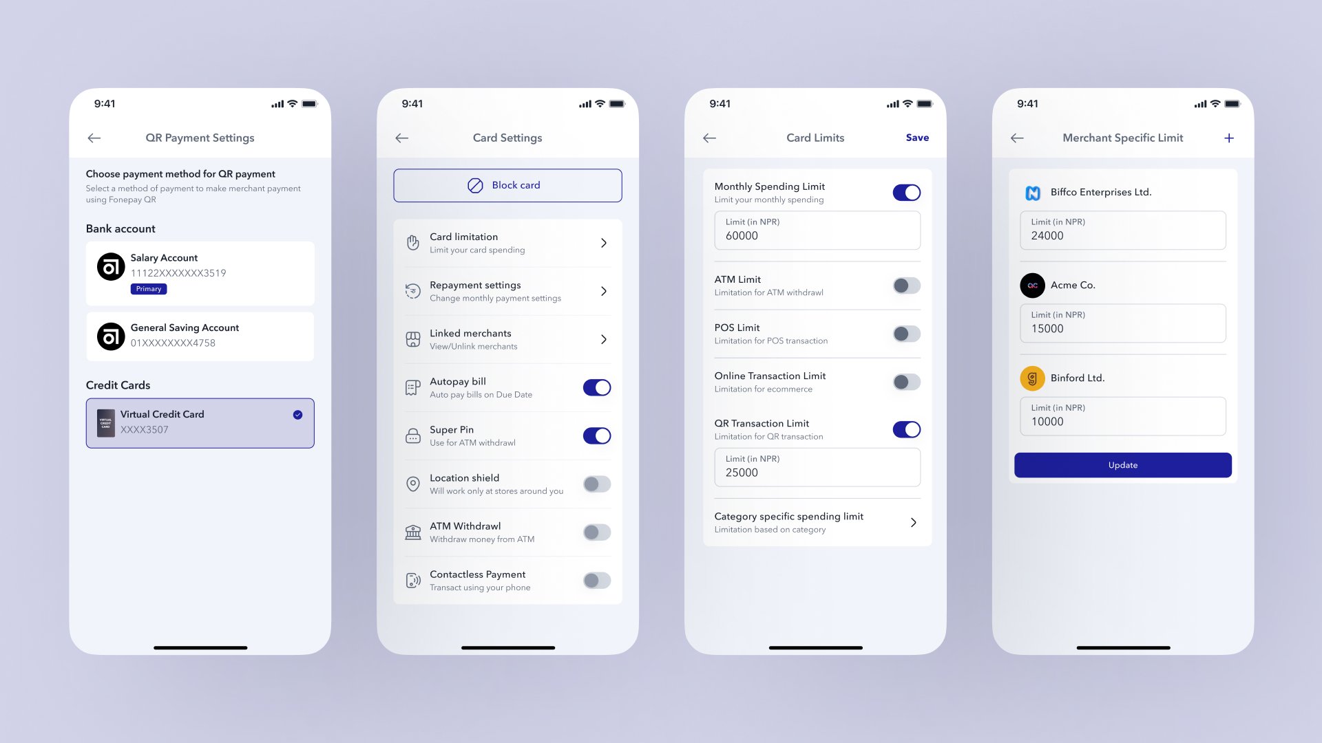
Built-in Control
Control is treated as a core part of the product, not an advanced setting buried in the interface.
Users can manage spending limits, define where the card can be used, configure QR transaction behavior, and restrict usage by merchant or transaction type. These controls are especially important in a context where trust in credit is still developing.
By making control visible and accessible, the product gives users more confidence and lowers the mental barrier to adoption.
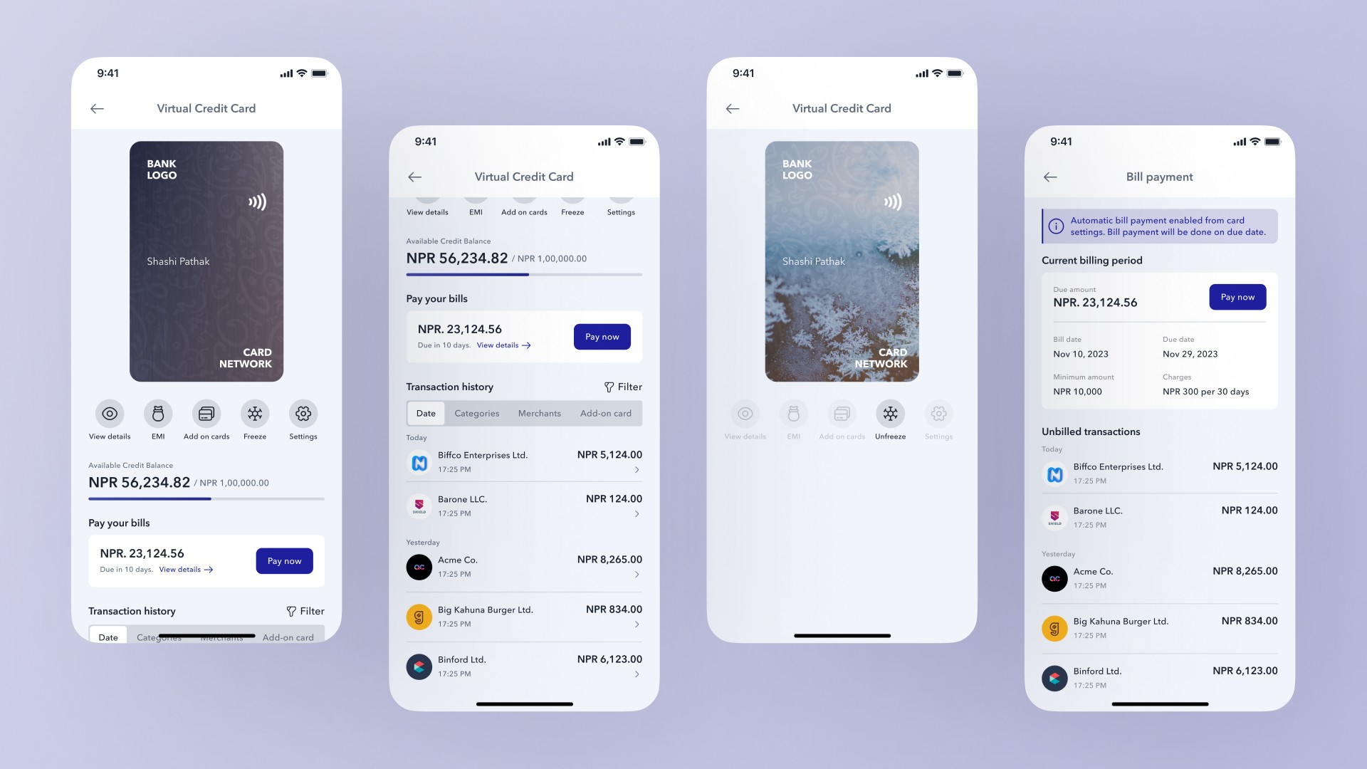
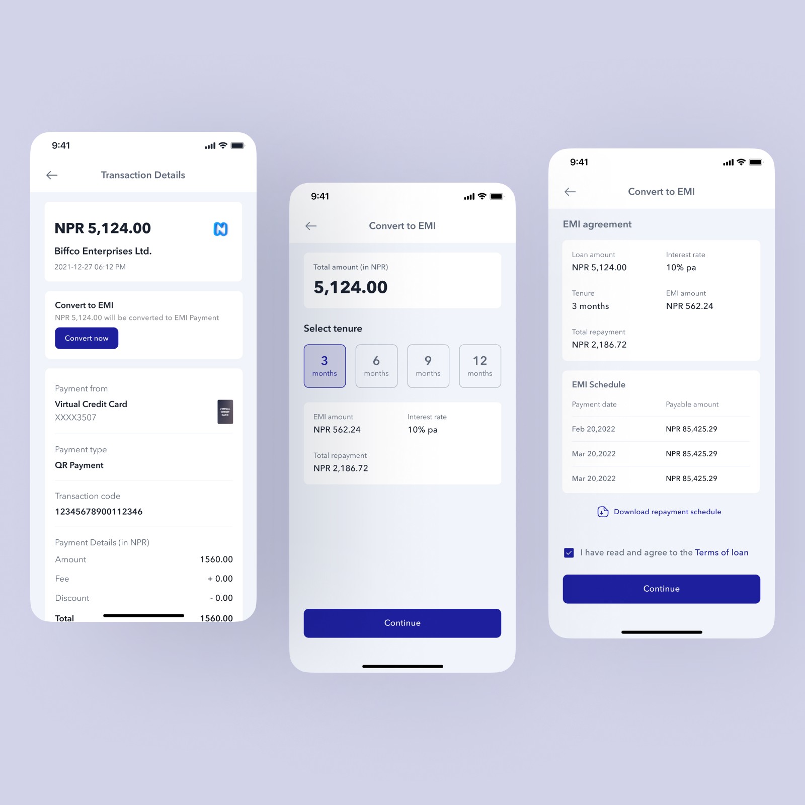
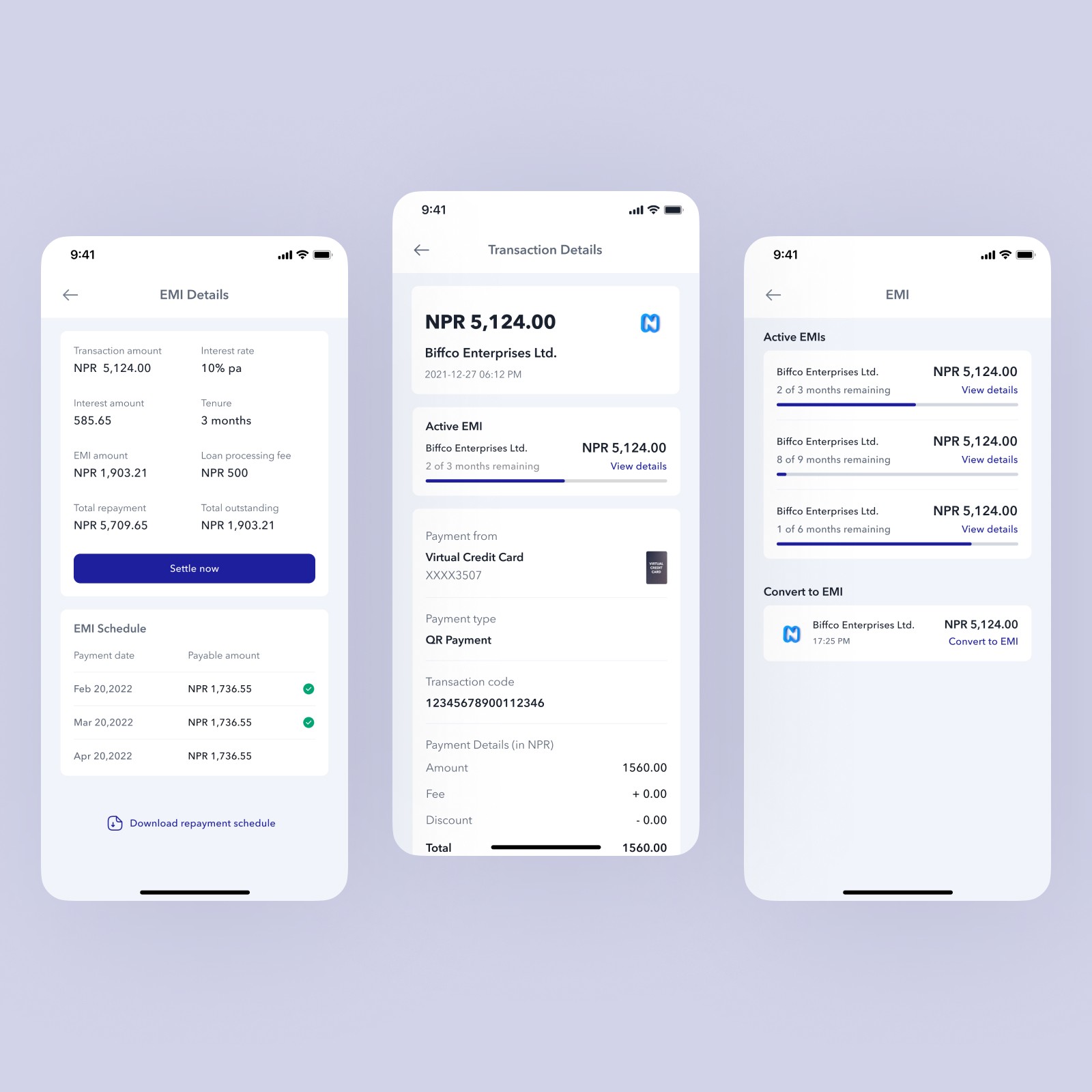
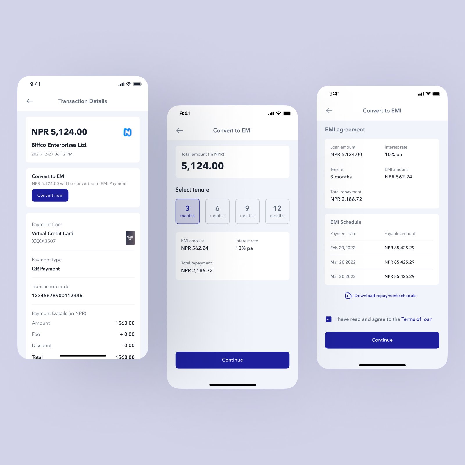
Flexible Repayment with EMI
Not every purchase should be treated the same way.
For higher-value transactions, the system allows users to convert a payment into EMI directly from the transaction flow. Users can choose a tenure, preview repayment terms, and review the total repayment before confirming.
What This Changes
This concept shifts credit from a physical banking product into a digital financial service.
It changes credit from something users apply for and wait on into something they can access directly inside the app. It changes usage from POS dependency into QR-based flexibility. And it changes repayment from a confusing afterthought into a visible, manageable part of the experience.
Most importantly, it aligns credit with a behavior that already exists.
Final Statement
Nepal did not adopt cards first. It adopted QR.
So instead of forcing credit into an outdated model, this concept allows it to evolve inside the system people already trust and use.
This project was as much about understanding Nepal's financial context as it was about designing screens.